HIST 100: Engineering The Past

  • Home
  • Syllabus
  • Schedule
  • Blog

Prownian Analysis

January 23, 2016 by Jake Sparhawk 1 Comment

image

image

image

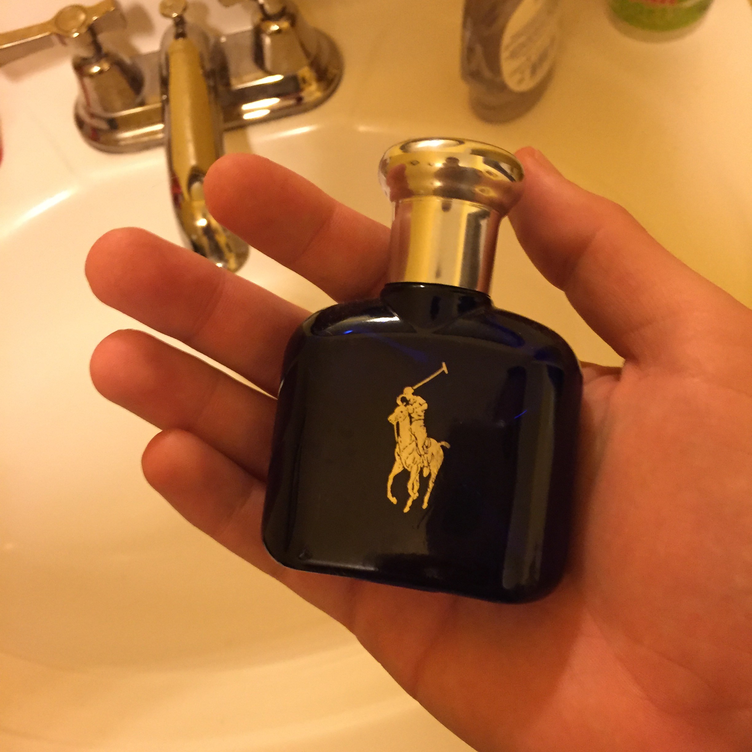
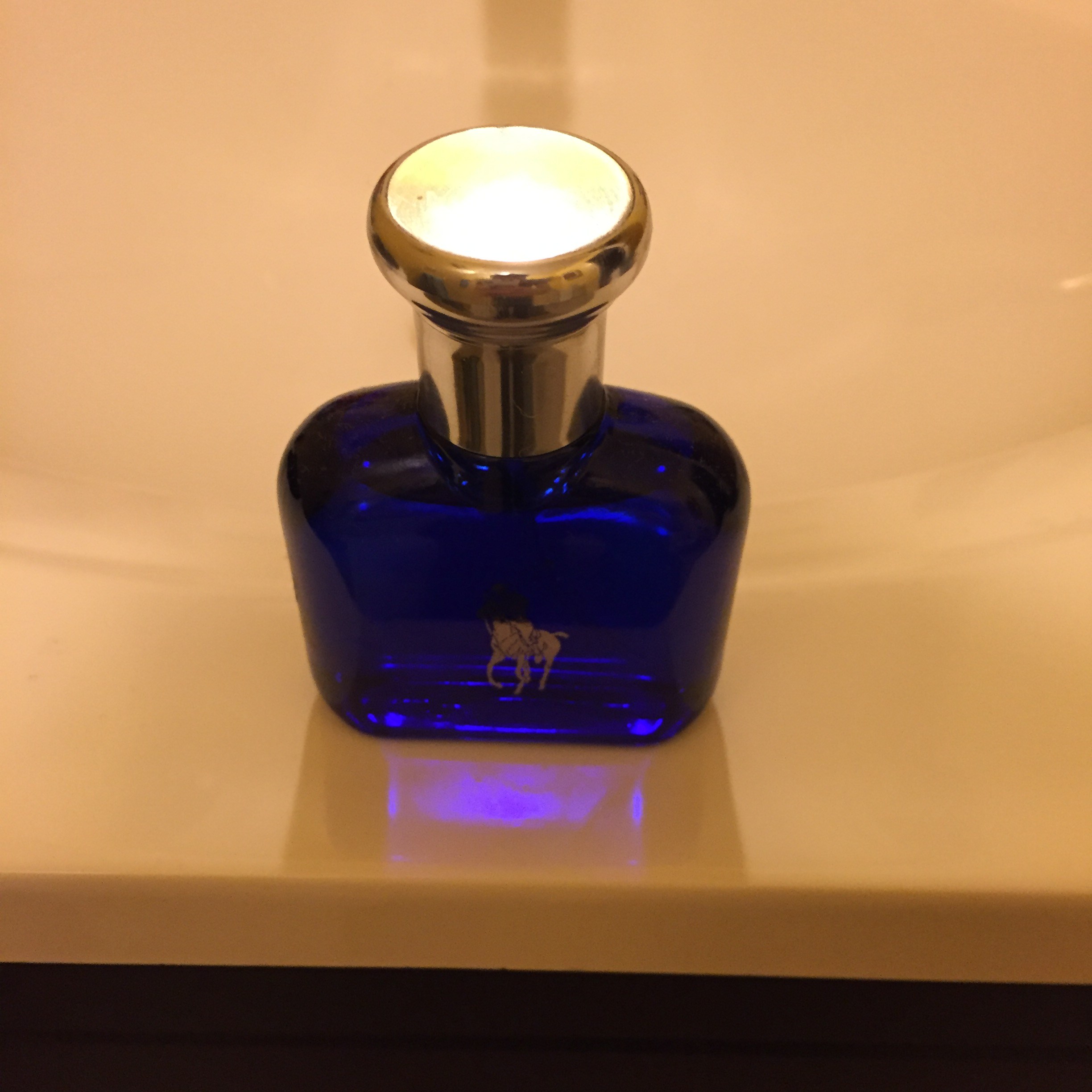
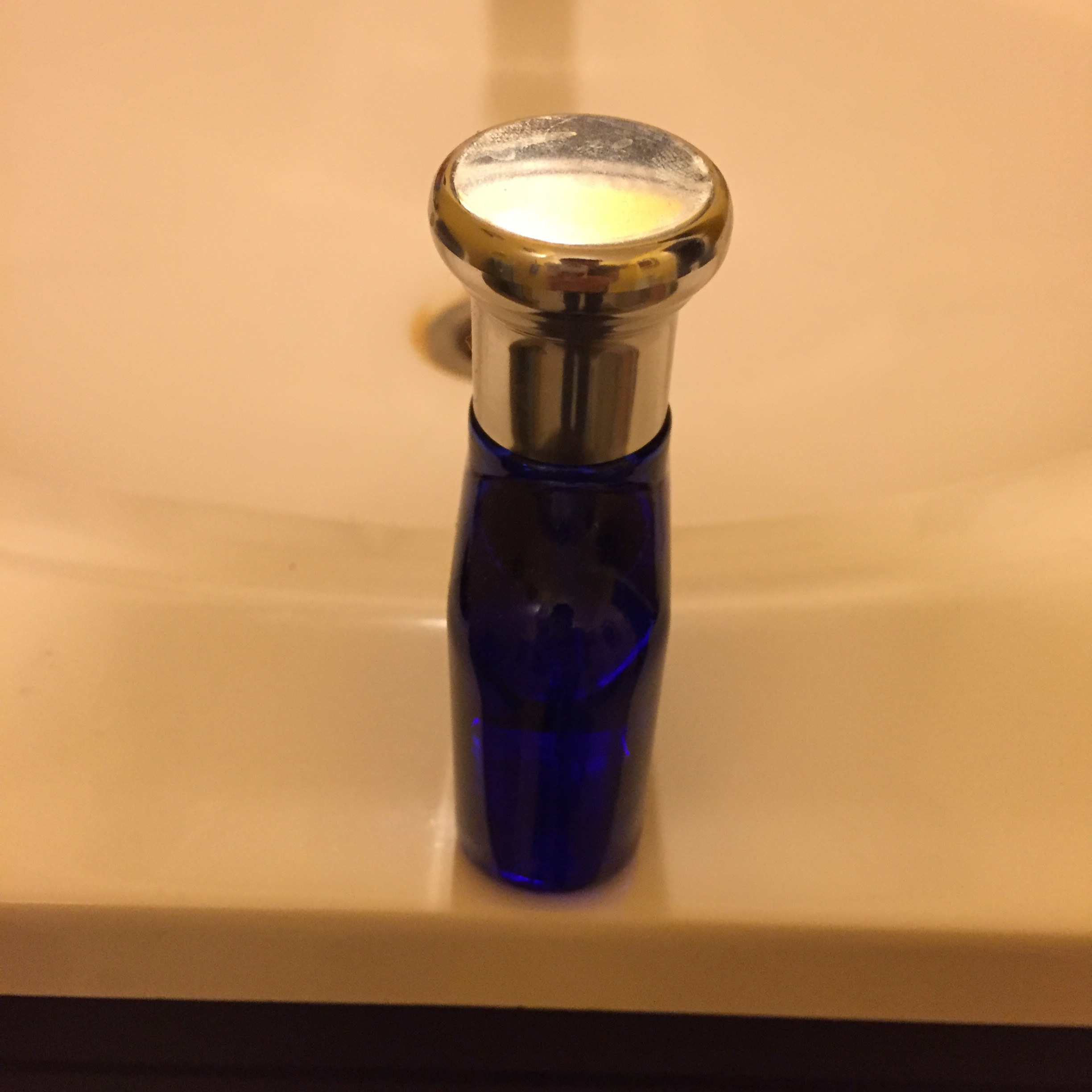
To begin, the description of the cologne bottle starts with the cap which is a metal rounded object that slides on and off pretty easily. Removing the cap shows a small pressure point of sorts. The liquid inside is a mystery to me. What holds the said liquid in place is a glass coating in a squarish shape with the cologne’s brand logo, Polo, placed on the front of the bottle.

Moving on to the deduction, I can safely assume that this object’s main purpose is to provide a sweet smelling fragrance to one’s odor. This one in particular has subtle smell, less than the others found in my bathroom, which can be liked by most people as it’s not as strong. How the smell is put on to people is through that pressure system that when applied with a little force will spray the cologne substance out, much like a straw pulling up water.

Finally on to the speculation, this object has a clear goal. Men buy products just like this in order to have a type of smell when they go out or any similar occasion. Some men like to honestly have the smell on them and use it as a symbol of attractiveness. Other men use it based on advertisement. Ads might state using this will attract females, which can be true, and use it for the act of sexual drive. What might be the percentage of men that buy it for the sake of themselves vs the act of sexual drive? What brand is most liked my men? By women?

“Polo Blue Eau De Toilette.” Www.ralphlauren.com. Accessed January 24, 2016. http://www.ralphlauren.com/product/index.jsp?productId=1813328.
This was a basic run down about why and how perfumes were made. The type of analysis was more heavily based on description and deduction. They described the different types of perfumes use different types of substances. They also described how people use them in order to “make people smell nice, and they are created to elicit reactions from other people.”

“History of Perfume and Cologne.” History of Perfume and Cologne. Accessed January 24, 2016. http://www.fragrancex.com/fragrance-information/history-of-perfume-and-cologne.html.
This page describes the fragrance in a more classy style of writing in order or attract their customers. This page was an advertisement page that mostly dealt with description of the cologne. As such nothing other than how the product was described as smelling was posted. This “article” was the best i could find for this object in terms of how it was analysed.

Filed Under: 02.1 Prownian Analysis, Group 5

Bridges

January 17, 2016 by Jake Sparhawk Leave a Comment

The Brooklyn Bridge and the Golden Gate both have similar qualities in design. For example, they have cable suspension engineering with two towers acting as support for the cables. They also connect two points of major cities, Brooklyn being New York City, and Golden Gate being San Francisco and Marin County. These two bridges are pretty similar in structure, only their placement and coloring differ, with Brooklyn a grey brick color and Golden Gate a copper rusty color. As for how people take pictures of them, I can see Brooklyn pictures using a lot of the city as a background. This is mostly due to pretty much all around the bridge is city. As for Golden Gate, I see more beauty in the pictures. Each picture is from an angle that shows how magnificent just the bridge is, some are even taken during that night which shows off its luminous lights.
Since the Brooklyn Bridge was built during the late 1800’s and designed by a German immigrant and his son, John and Washington Roebling, it shows a little bit of a European style of architecture. The two towers have almost a Gothic look to them which is tall arches that show a power stature. Also as a added note, the bridge was built to be six times stronger than it needed to be.
As for the Golden Gate, this bridge was built towards the mid 1900’s and as such was bit different when building. They first of all had safety nets put out for the workers which minimized the death toll to 11 men, rather than the 20 lost building the Brooklyn Bridge. Those who survived the fall by being caught by the net join what was called the “half-way to hell” club. As for the coloring of the bridge, it was suggested to be a black and yellow striped color for ships to see it, but was changed to the orange we see today because the orange was used as a coating for air quality reasons.
Both these bridges are known worldwide and are a big part of cities they reside in. They show the American engineering and prowls to build amazing constructions. Because of this we admire it and use it our culture to be recognized.

Filed Under: 01.2 Bridges, Group 5, Groups

First Post

January 12, 2016 by Jake Sparhawk 4 Comments

My name is Jakob Sparhawk, but i prefer the name Jake if you please. I was born and raised here in Boise, Idaho. Hobbies of mine include playing soccer with friends in my spare time, reading weekly manga and starting new ones, and as well as watching anime. I decided that Boise State was my calling, due to money constraints and easy access. I chose my major to be in pre-pharmacy and hope that within a few semesters i can transfer over to ISU to finish up my schooling. I don’t really have a reason for choosing the path of pharmacy, but life sometimes pushes me towards unanswered regions, and such is that. I’m prepared for your teachings and the numerous classes ahead in my college career.

Filed Under: 01.1 Your Lens, Group 5

  • « Previous Page
  • 1
  • 2
  • 3
  • 4

Students

Log in here.

Groups

Student Contributions

From the Professor

Copyright © 2026 · Minimum Pro Theme on Genesis Framework · WordPress · Log in